
Why the refresh
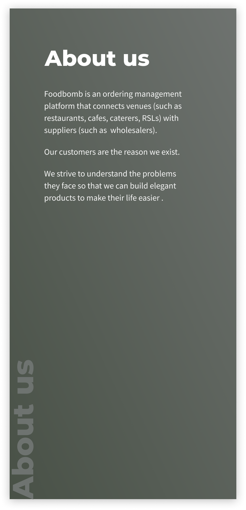
Foodbomb is two years old 🐣, and before today most of the branding elements have been more of an emergent property of the system than a planned effort.
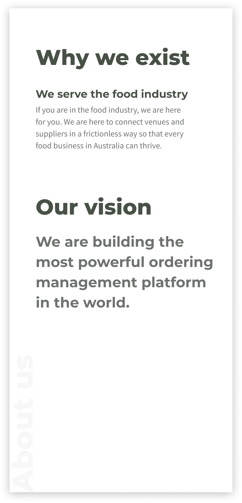
We’ve grown up a lot over the past year, and realised that our brand didn’t reflect what we are doing for our customers: delivering consistent quality, service, and prices.
What‘s new, what’s not
Because we did everything in-house and we are a small team, we started by deciding what we would do and what we wouldn’t.
Brand name
Our company name was picked by one of the most brand savvy humans out there: our founder’s 8 year old. So obviously we didn’t even consider making the change.
Also renaming would have required a much more in-depth analysis that we decided to skip for now. This was a brand refresh, not a full rebranding. On top of this, when chatting about voice & tone we landed on the greatest of all puns — stay tuned.
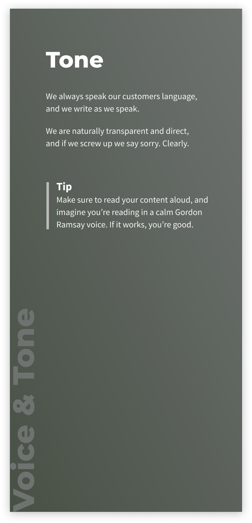
Voice & tone
At Foodbomb we believe that a core element of a brand is the voice & tone we use when speaking (writing) to our customers, so that was our starting point.
We are also fortunate enough to have a team who have almost all worked in the food industry before the jump into the tech world — including myself. And if you’ve worked in a kitchen you know exactly what the voice & tone is over there. If you haven’t, imagine Gordon Ramsey’s Hell’s Kitchen.
Here’s what we came up with.

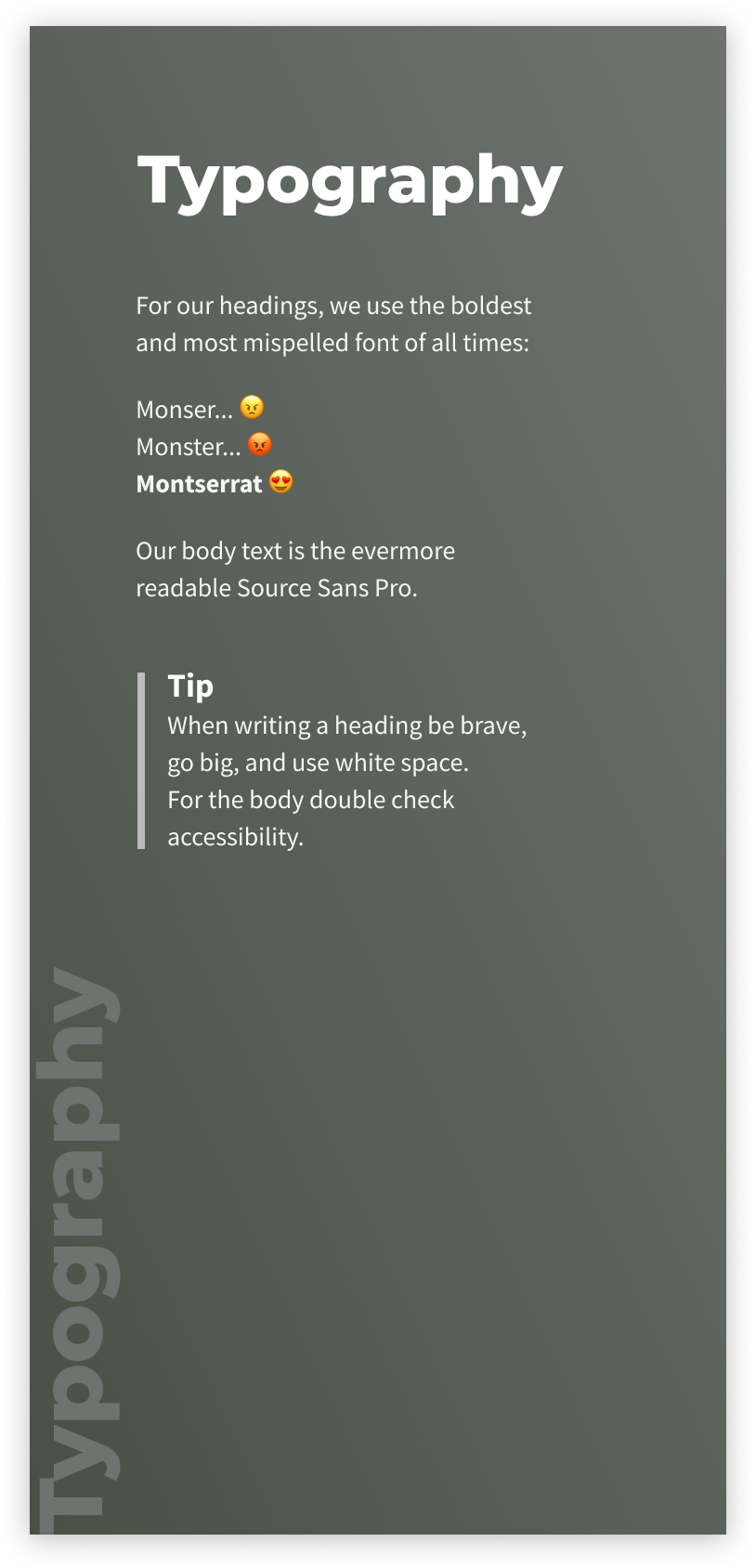
Visual identity
For our visual identity we iterated quite a bit, and here is what we landed on. And 🥁🥁🥁the pun… we have our very own F-bomb to throw around!

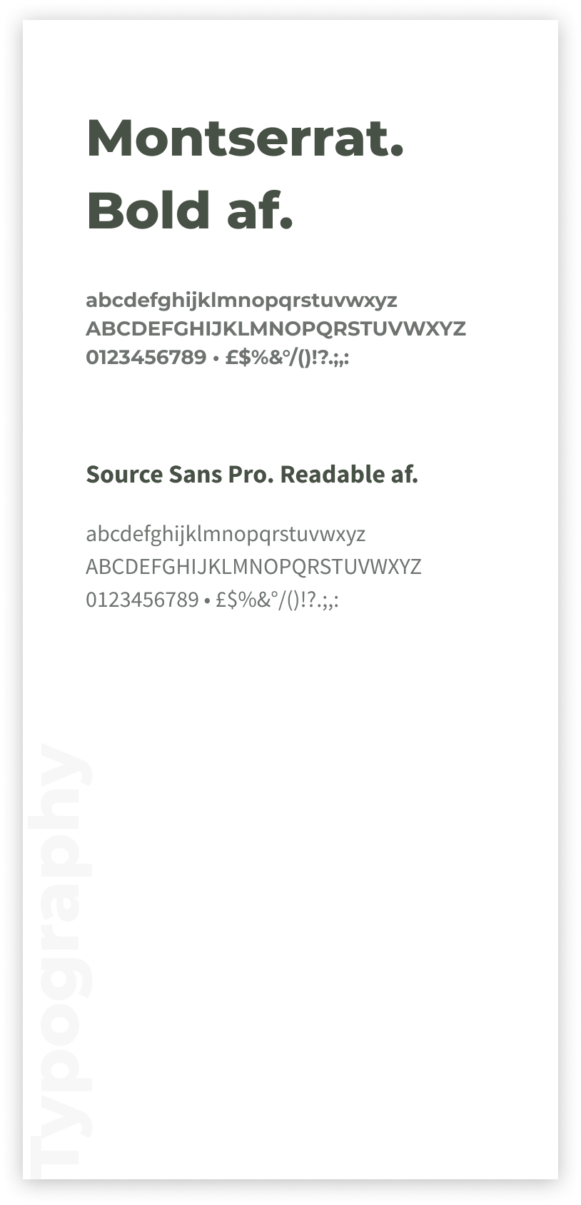
Typography
Until we can spend 500K on an agency, we’ll be using these popular fonts. They are bold af and readable af.
Colour
Being the only designer in the team, I believe it’s much better to empower engineers to make design decisions, rather than bug them all the time; and because as a startup we want to move fast, stay accessible, and avoid inconsistencies, we are creating a toolkit for making decisions simple.
This is why our palette is very, very minimal.


Collab
There’s one main reason our brand refresh process went so smoothly: we worked together. We made every decision as a team, involved all the stakeholders since the very beginning, and focused on our customers. This was the best part of it all. 💚
∞ Work in progress
We are aware that our brand is, like all things, fluid. We know that there’s still a long way to go, but we are convinced that this work will be a solid foundation for the years to come.
Before we know how successful the refresh is, we’ll have to wait a couple of months while tracking our brand perception, conversion rates, and collecting customer feedback. We are cool we with whatever the outcome though, because either way we’ll learn and iterate.
If you are here to take a peek at our brand guidelines, you can checkout our live documents (Figma files):
Feedback welcome
If you have any feedback or just want to say hi, shoot me an email at mattia@foodbomb.com.au
Have an explosive day!