
Summary
Deputy is a workforce management system for hourly workforce. The platform’s core features revolve around the digitisation and management of hourly shifts. At a high level, workers can clock in and out of their shifts, and perform basic HR tasks (e.g. request leave), while managers have more advanced features available (e.g. rostering, forecasting, reporting).
This project originated to solve a compliance need for Deputy’s American users.
A new set of laws was issued with strict rules requiring managers to give (and keep a record of) the number of meal breaks and rest breaks of their hourly workers according to different sets of rules (for example, one 10min. rest break every 2h worked).
Each US state had different rules, making compliance really difficult for any manager, to the point that (as emerged from user interviews) some were granting up to $100 extra pay per shift to avoid heavy fines of up to $15,000.
The feature ended up being used by over 65% of our American user base within the first 30 days since rollout, and up to 87% after the first 60 days. Not only that, but the feature became one of our Sales team best weapons.
Problem
A new set of laws in the US requires employers to give and track their employees breaks throughout shifts. The need for compliance opened up the US market for various fast food chains. Each US state has different ways to attribute break lengths, so a high level of flexibility was needed.
The project needed to work across the whole Deputy ecosystem, including ipad app, mobile (iOS and Android) apps, as well as desktop.
Team
For Break Planning, I was the Lead UX Designer working closely with the Product Manager (PM), collaborating with iOS developers, Android developers, and System Engineers looking after the Deputy API.
Process
Understanding the problem
Given the clear goal and existing systems, we started off understanding the problem through user and stakeholder interviews, especially relying on Deputy’s legal team for the copliance requirements. With the PM, we decided to lead the design together, while keeping developers in the loop before making any decisions, checking for technological restrictions on each plausible designed solution, and user testing prototypes for fast iteration.
iPad kiosk app
Following, is the evolution of the feature design for the iPad app. The iPad is used by employees to clock in and out of their shifts and – after the feature launched – scheduled breaks. Breaks can be either paid (called Meal Breaks) or unpaid (called Rest Breaks), as well as scheduled or unscheduled. Scheduled breaks are mandatory, thus can’t be missed.
Fast iterations through user testing
The first explorations were concerned with transforming the existing layout of the app by showing the user the relevant information to:
- Be able to clock in and and out of breaks as needed
- Know whether they needed take a break
- Know whether they are on a break or on a shift

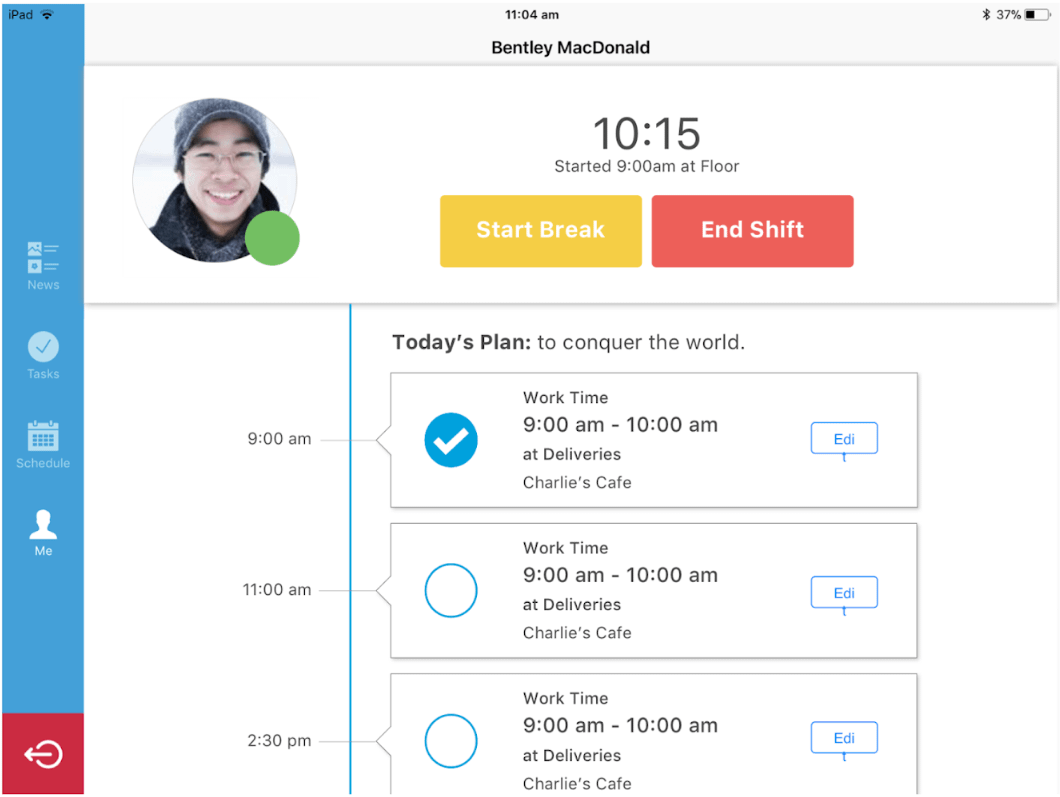
After a few rounds of user testing, it became clear that the direction I started with was extremely far from solving the user’s problem. After two rounds of testing, I discovered that the information shown was overly complicated and especially not scannable.
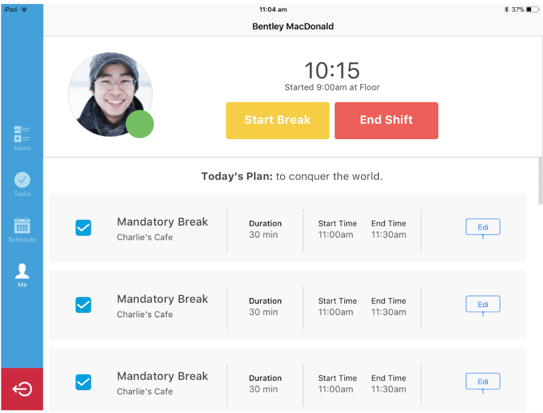
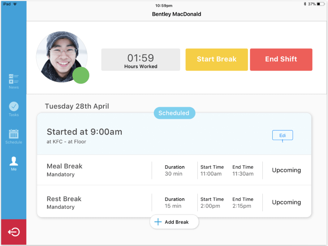
Final touches
Following is the final touch: an elegant micro-interaction that not only is effective for letting the user understand the action has been completed, but to inform the user about the state of the system. Two heuristic evaluations checked at the price of one!
Here’s a user-testing session that goes to show how good a micro-interaction can be (worth watching)!
You can also try the prototype yourself right here. Simply clock in and out of your break.
iOS app
Here is the prototype I used for usability testing with managers, tasked with the following scenario: As a manager, you’ll be adding a shift on the 22nd of June, from 9 to 5, with a 10min. meal break from 1:00pm to 1:10pm, and one 25 min. rest break with no time restrictions.
For the mobile app design we got started with iOS. Even though as opposed to the iPad kiosk app the complexity was reduced, still quite some effort was needed to ensure success across the whole ecosystem.


Android app
After testing the iOS app, and ensuring usability, I restyled the components according to Material Design guidelines. I was very lucky to find a developer with an even greater understanding of the Material Principles than I did, and we worked together to finalise the app.


Results
The feature ended up being used by over 65% of our American user base within the first 30 days since rollout, and up to 87% after the first 60 days. Not only that, but the feature became one of our Sales team best weapons.
Continuous refinement
We still need to solve accessibility issues (i.e white text on yellow button) and unnecessary traffic light systems all due to legacy design, all things we aim to solve with the Design System currently under development.